Access Training
Student portal design
Access Training, a vocational training company, approached us to redesign and modernize their student portal. The existing portal was outdated, lacked clarity, and didn't provide the necessary features to support student success. The primary goal of the project was to improve the user experience by making the portal more intuitive, adding key functionalities, and ultimately helping students achieve their training goals more efficiently.
Visual Design
UI & UX Design
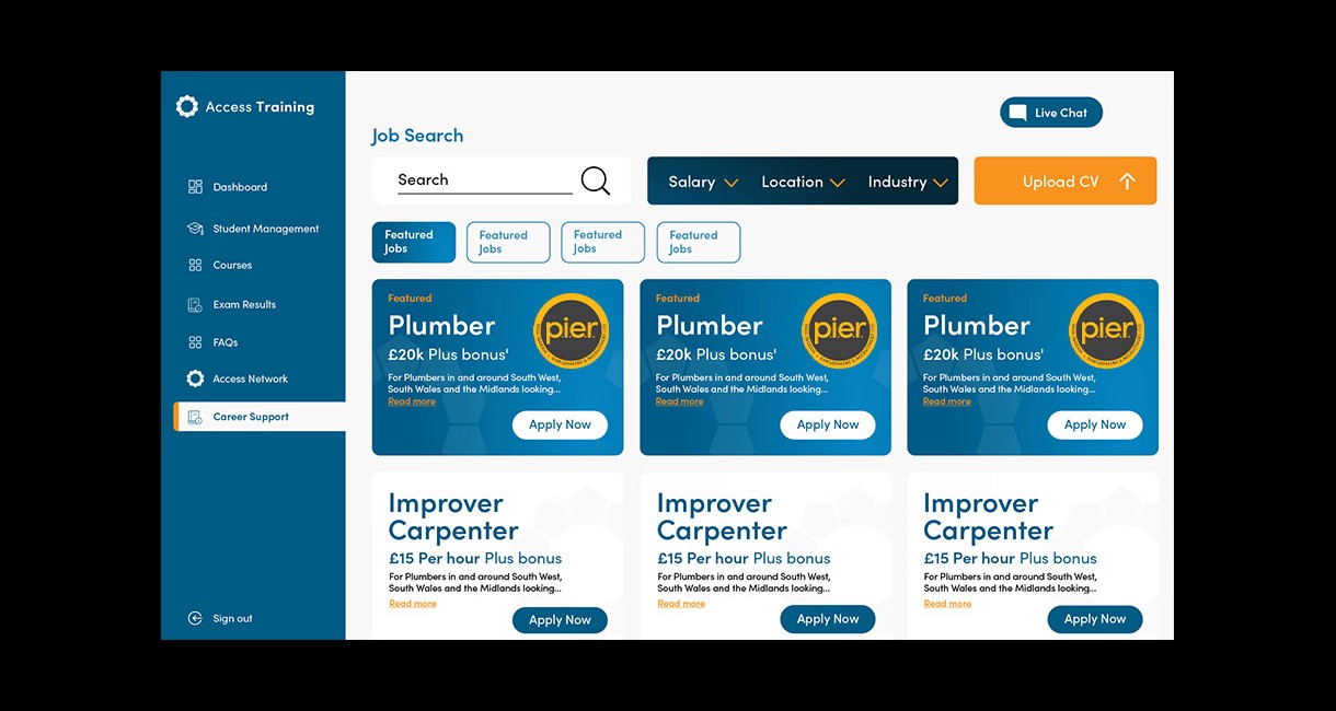
I started by analyzing the shortcomings of the previous portal design, focusing on user pain points such as poor navigation and the absence of tools to assist students in managing their learning experience. I worked on updating the overall interface, prioritizing clarity and ease of use while aligning the design with Access Training’s brand identity. To enhance functionality, I incorporated several useful features, including a calendar for tracking important dates, a note-taking tool for organizing study materials, a job search feature to help students find employment opportunities, and an onboarding/tutorial section to guide new users through the portal’s features.
The previous portal design (below)
The redesigned portal has significantly improved the student experience by making key information more accessible and empowering students to manage their training journey more effectively. The additional features not only help students stay organized but also enhance their job search efforts, contributing to higher engagement and satisfaction. Access Training has reported positive feedback from students, with many highlighting the new features as critical tools for staying on top of their studies and career goals.


